Launch of New Heidi Plus Community Dashboards
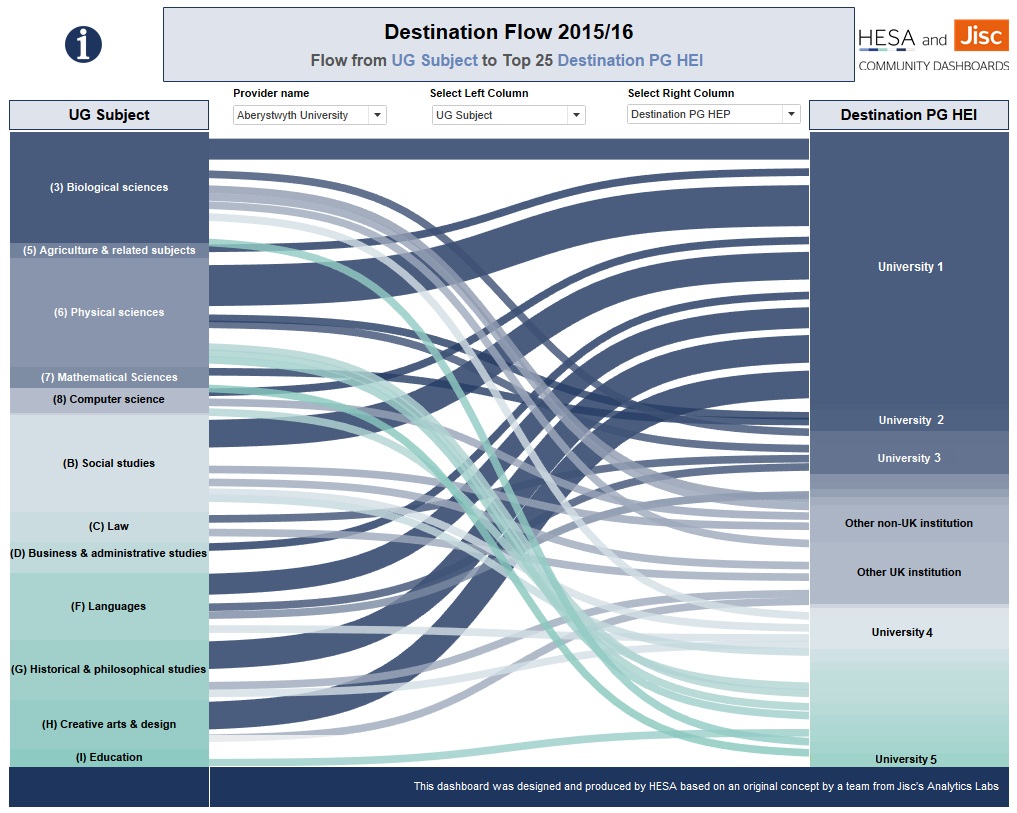
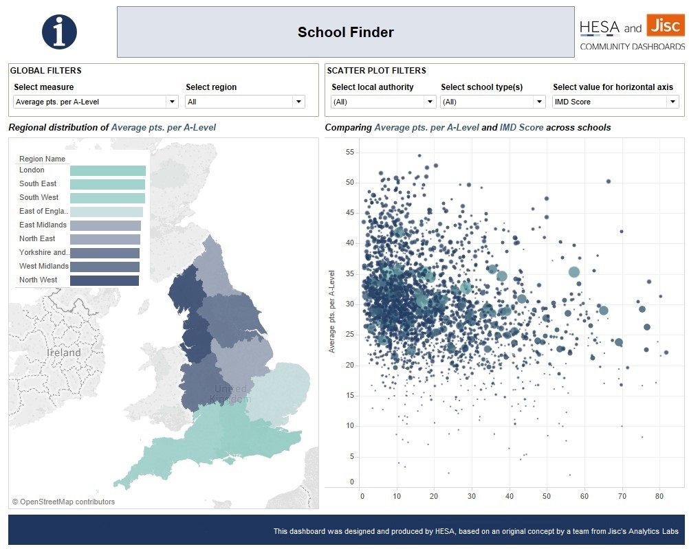
Community Dashboards within Heidi Plus are launched this week - dashboards which have been produced ‘by the sector, for the sector’. Following the Jisc Heidi Labs and Analytics Labs initiatives, we’re expanding Heidi Plus to include these dashboards.
It’s our way of further improving and expanding the business intelligence available to the HE sector. In addition, a new Community Dashboards' Expert Group is being formed from HE data professionals and alumni from previous Labs cohorts – our community experts' forum.

Community Dashboards in Heidi Plus combine the collaborative expertise of HE professionals and Jisc, with HESA and other HE sector data, and the latest visualisation technology, to bring invaluable sector insight to all HESA subscribers and Jisc members
Heidi Plus enables HE to interrogate HESA data in depth and produce striking graphics, maps, and visualisations.
So, what is unique about Community Dashboards? The future direction of these collaborative dashboards within Heidi Plus are shaped by the HE community - that is, experts and specialists from within HE who combine their knowledge and expertise to develop prototype interactive visualisations which provide interrogable data answers to specific sector questions, for the benefit of their peers. Typically, the community consists of more expert users, including former Jisc's Analytics Labs alumni. It can shape future topics addressed by Jisc's Analytics Labs teams, can submit requests, and even contribute to further teams of lab participants, ensuring that future dashboards come from representatives of those producing and using them in the first place.
I joined HESA a little over six months ago, at an exciting time, with an opportunity to play an important part in this initiative. Jisc has involved HE professionals in virtual, collaborative teams around the country, and with HESA data at their disposal, helped them develop dashboards that answer the questions they want answering to support them in their profession.
Heidi Plus currently has over 2,600 users at 147 HE Providers, with a full HESA subscription.
From my point of view, the best part has been being to meet and assist an ever-growing number of people participating in developing the dashboards. I can’t quite manage a catchy alliterative ‘Penzance to Perth’ or ‘Dover to Dundee’, but my travels have taken me throughout HE providers in England, Scotland and Wales, so far meeting at least ten teams, when their online collaborations become virtual face to face meetings. In my short time on the project, I estimate that I have met and worked with participants from at least fifty different HE providers. Our teams’ efforts have then culminated in Showcase events, usually in Manchester, where teams have presented their proof of concept dashboards to an audience of fellow participants and invited experts, for feedback.
Non-profit organisations can also subscribe to Heidi Plus as an invaluable tool for research, reporting, and policy-making.
And, of course, the variety of roles and experience (Tableau/technical or otherwise) makes for some great collaboration and teamwork. We meet HE staff from planning, finance, marketing, HR and more, as well as academics, all from junior to director level. Our teams use Tableau, Alteryx, and related software, and usually start with a mixture of experience – including none at all. I'm one of the Jisc/Hesa support team which means that I get to train, help, advise and oversee where necessary, at every part of the process. Very often the teams learn a lot from getting stuck in and trying these things themselves, in the knowledge that I am there if needed (typically, for those tricky Tableau bits!).

Community Dashboards is delivered through Tableau, Alteryx, and related software, which enable users to access data from different locations to support an integrated approach to HE business intelligence.
I’ve often explained my role as wearing two hats – my Jisc hat (when I’m working with Analystics Labs teams and on thedevelopment of the Community Dashboards) - and my HESA hat. Wearing my HESA hat, I’ve been working hard with the team to polish, revise, refine, test, quality assure, update and publish many of these dashboards to Heidi Plus in the knowledge that quality is guaranteed, and all agreements for data sharing are in place. It’s a great position to be in, to facilitate the dashboard production process further down the line to the extent of being involved right from the start of a concept through to delivering the final product. And if the dual nature of this role needs a constant switching from one aspect to another, even if that means the occasional swapping of metaphorical headgear, then that’s fine by me.
In a new development, we are also releasing Community Dashboards BETA in October, where dashboards can be seen at any point from their prototype form onwards, with the ability for those within our Community Dashboards' Expert Group and Heidi Plus users to comment and vote on those they might wish to take forward into full production. This should mean both an increase in the quantity of dashboards we produce as well as a chance for Jisc's Analytics Labs participants to see their work online within our Heidi Plus service a lot more promptly. We’ll even get the same community to vote on ideas and feedback on these beta dashboards.
So, I’m really looking forward to being able to present the result of some excellent, collaborative hard work going on in the HE sector, and as Community Dashboards set the standards for credible, accessible, and interactive HE data, the output will grow, with more scheduled dashboard releases throughout this year and beyond.
Find out if your organisation subscribes to Heidi Plus

Neil Richards
